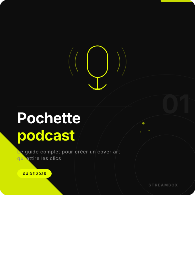
Your podcast cover art is the first thing a listener sees before hearing a single word of your show. On Apple Podcasts or Spotify, it appears as a thumbnail among hundreds of other shows. In just a few seconds, it needs to grab attention, convey your topic, and make people want to click.
According to data from Buzzsprout, 62% of listeners are more likely to check out a podcast with cover art that catches their eye. In other words, a poor podcast cover art design costs you listeners before they’ve even heard your content. This guide explains how to create an effective one, which tools to use, and what mistakes to avoid at all costs.
If you haven’t launched your show yet, start with our comprehensive guide to launching a podcast, then come back here to refine your visual identity.
Why Your Podcast Cover Art Is Just as Important as Your Content
Imagine two podcasts on the same topic, with the same audio quality. One features a professional cover image that’s clear and legible even when scaled down. The other features a blurry photo with a font that’s hard to read. Which one will get more clicks? The answer is obvious—and yet, many podcasters overlook this element, thinking that content alone is enough.
In reality, your podcast cover art serves several purposes at once. It acts as your showcase in podcast directories, reinforces your brand identity every time it’s shared on social media, and sets the tone for your show even before listeners hear it for the first time. For companies producing a corporate podcast, it’s also a communication tool in its own right, consistent with the organization’s visual identity and level of professionalism.
The dimensions and technical specifications of the podcast sleeve
Before designing anything, you need to be aware of the technical requirements set by the platforms. The recommended size for any podcast cover art is 3,000 x 3,000 pixels in a square format. This is the standard adopted by Apple Podcasts, Spotify, and most podcast directories. The minimum accepted size is generally 1,400 x 1,400 pixels, but at this resolution, the image will appear lower quality on high-definition screens.
For the file format, use JPG or PNG as needed. JPG is better suited for images with photos or gradients because it compresses more effectively. PNG is ideal for designs with solid backgrounds, crisp text, or precise graphic elements. In any case, the file size must not exceed 512 KB for Apple Podcasts. Finally, always work in RGB color mode—never in CMYK, which is reserved for printing. If you start with a CMYK file, the colors will appear distorted on digital displays.
The Golden Rules for Creating an Effective Podcast Cover
Readability Above All Else
Your podcast cover art will often be displayed in a very small size in directories—sometimes as small as 60 x 60 pixels on mobile devices. Anything that’s unreadable at that size might as well not exist for the listener. So choose a bold font, ensure strong contrast between the text and the background, and limit the number of visual elements. The title of your show should be the first thing the eye catches. If it’s overshadowed by other graphic elements, you’ve missed the main purpose of the cover art.
Simplicity as a Visual Strategy
The most effective covers are often the simplest. One dominant color, one accent color, and white or black for the text. If you use more than three colors, your design may look cluttered and unprofessional. Similarly, if you include a photo, make sure it’s sharp, well-lit, and relevant to the topic of your show. Avoid featuring recording equipment on your cover art—it says nothing about your content, and Apple Podcasts itself explicitly advises against it.
Consistency with your brand identity
If you’re producing a corporate podcast, your podcast cover art should align with your brand guidelines: brand colors, corporate typography, and a well-positioned logo. This is especially important for corporate podcasts produced in a studio, as the visual quality must match the audio quality. A sloppy cover art design paired with a flawless audio production sends a mixed message to your listeners.
Small-scale testing: an essential step
Before finalizing your cover art, resize it to 100 x 100 pixels on your screen. If the title remains legible and the design is still recognizable, you’re on the right track. If not, simplify it. This test takes thirty seconds and prevents you from publishing ineffective podcast cover art across all platforms.
What tools can you use to create a podcast cover?
For beginners, Canva remains the go-to choice. The tool offers hundreds of ready-to-use podcast cover templates, available online with no installation required. The free version is more than enough to create a solid design. Search for “podcast cover” in the search bar and customize an existing template by adding your own colors and fonts.
Adobe Express (formerly Adobe Spark) is an attractive free alternative, especially if you already use the Adobe suite for other creative projects. The export quality is impeccable. For advanced users, Photoshop or Illustrator offer complete control over every element of the design, which is particularly useful for complex gradients or elaborate visual effects.
For a corporate or professional podcast, investing in a podcast cover designed by a graphic designer is often the best long-term decision. A consistent and original visual identity sets you apart in podcast directories for the long term. At StreamBox, our team can help you create your visual identity as part of a turnkey production package.
The Most Common Mistakes to Avoid
The first mistake most beginner podcasters make is to overload the cover art with text. The podcast’s name is enough. Adding a subtitle, the host’s name, a tagline, and a logo turns your cover art into an unreadable poster. Choose just one key piece of information per visual element.
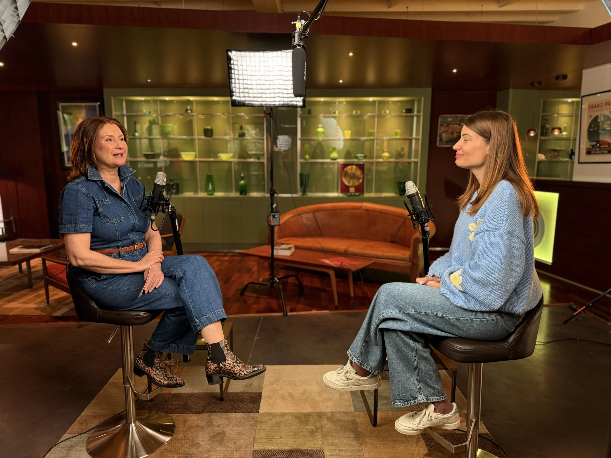
The second mistake has to do with image quality. A blurry or pixelated photo immediately undermines the credibility of your show. If you use a photo of yourself, have it taken under professional conditions—ideally with careful lighting, like the kind we use in our studios in Rhode-Saint-Genèse.
The third mistake is choosing a design that’s too trendy. Graphic styles go out of style. A podcast cover that’s ultra-modern today may look dated in eighteen months. So opt for a timeless design rather than the latest trends. Finally, always think square from the very beginning of your design process—some designers work in a 16:9 aspect ratio and then crop it to a square, which often results in an unbalanced look.
Podcast Packaging and Brand Identity: The Case of Businesses
For a business, the podcast cover art is much more than just a profile picture. It represents your organization in the context of long-form content—a space where your prospects and employees give you their time and attention.
There are two approaches you can take. The first is to create a simple corporate design featuring the company’s logo and colors. The second is to develop a standalone visual identity for the podcast—one that is distinct from the main brand but consistent with it. This second approach is often more effective for reaching an audience outside your usual network.
If you’re launching an employer branding podcast or an internal podcast for your teams, create a dedicated cover art for each episode. This reinforces the sense that each format has its own identity and editorial value.
Frequently Asked Questions About Podcast Artwork
Can you change your podcast cover art after launch?
Yes, and it’s even recommended if your first version isn’t satisfactory. The update is done directly through your hosting platform (Buzzsprout, Ausha, Spotify for Creators, etc.) and is automatically pushed to all directories within a few hours. Your existing subscribers won’t miss a thing—only the visual layout changes.
Should you put your photo on the podcast cover?
Not necessarily. For an interview or personal branding podcast, a photo can help humanize the show. For a corporate or topic-based podcast, an illustration or graphic design will often be more effective. If you choose to use a photo, have it taken in a professional setting with appropriate lighting.
What font should you use for your podcast cover art?
Choose a sans-serif font to ensure readability at small sizes: Montserrat, Poppins, Raleway, or Inter are excellent choices. Avoid script or decorative fonts for the main title—reserve them, if necessary, for a secondary, less important subtitle.
Does the podcast cover art affect search engine optimization?
Indirectly, yes. An attractive podcast cover art improves your click-through rate in podcast directories, which increases your listener count and improves your ranking. The image file name and alt text you provide to your hosting service also contribute slightly to your podcast’s SEO.
Make sure your podcast cover art looks great from the very first episode
A well-designed podcast cover is the starting point for a credible show. But it’s worthless without quality content to back it up. At StreamBox, we support you from start to finish: sound design, studio recording, post-production, and multi-platform distribution. Contact us for a no-obligation initial consultation.
Be sure to check out our studio packages and rates for an initial estimate of your project.